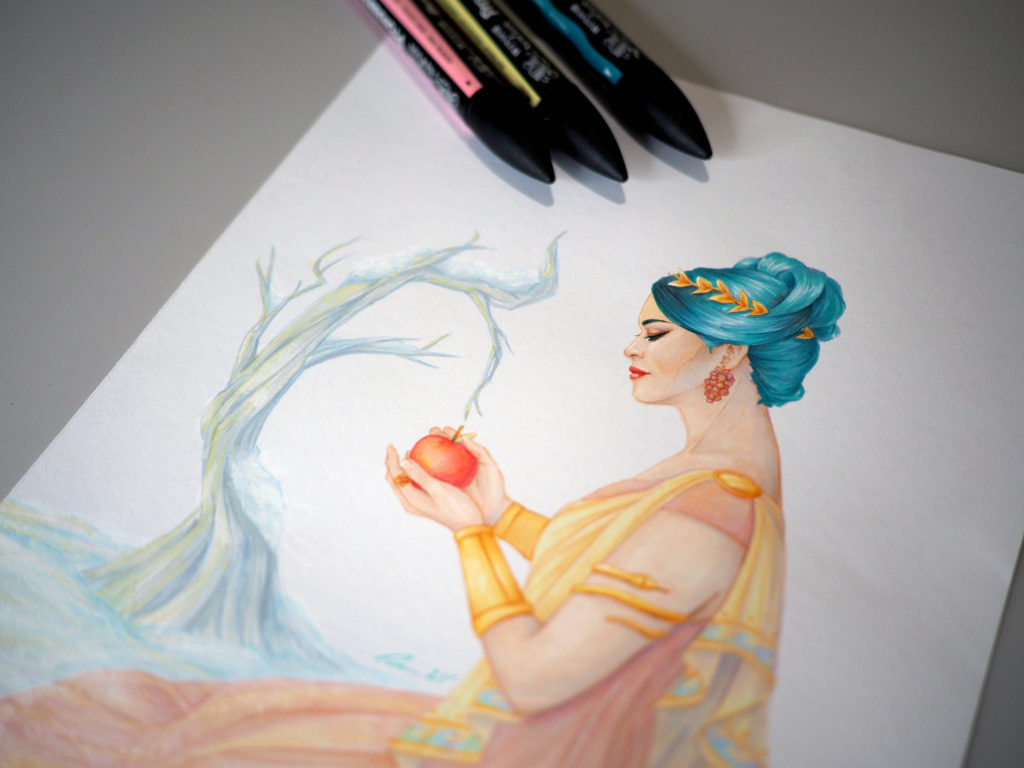
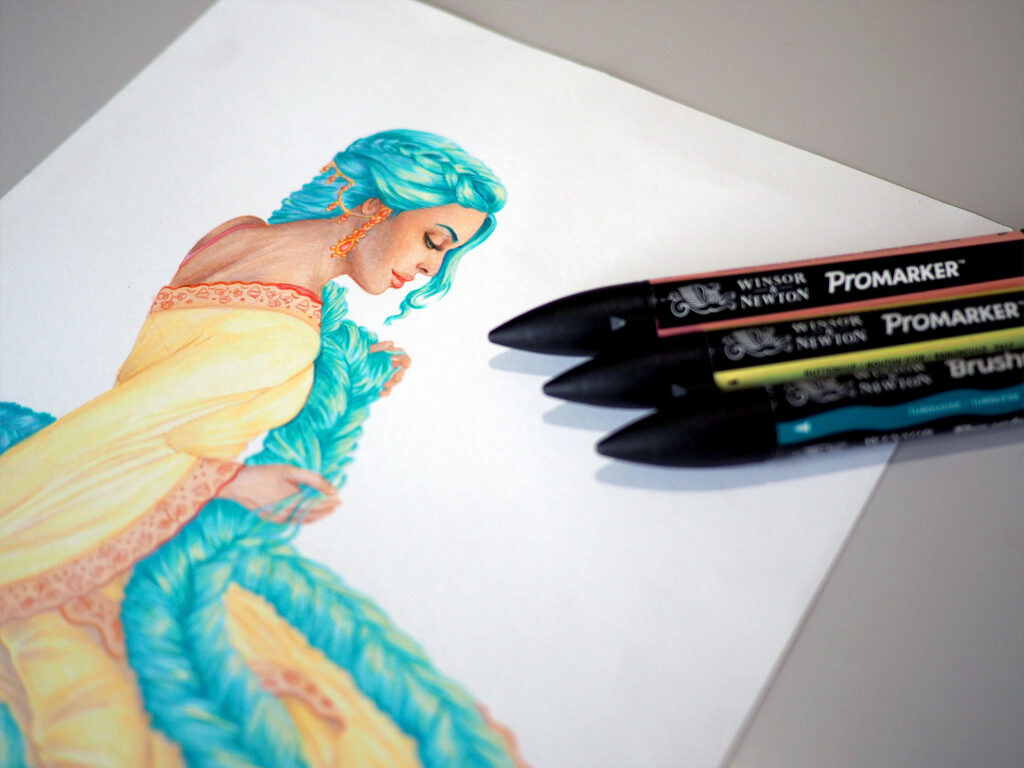
Do you feel like your artwork lacks the vibrancy and liveliness that you want it to have? Don’t worry! In my short video, I’ll walk you through what I believe are the three most crucial aspects of colouring artwork.
Please leave a comment below to suggest topics for my upcoming videos. 👇👇
Video Transcript
1. Don’t be afraid to mix your hues!
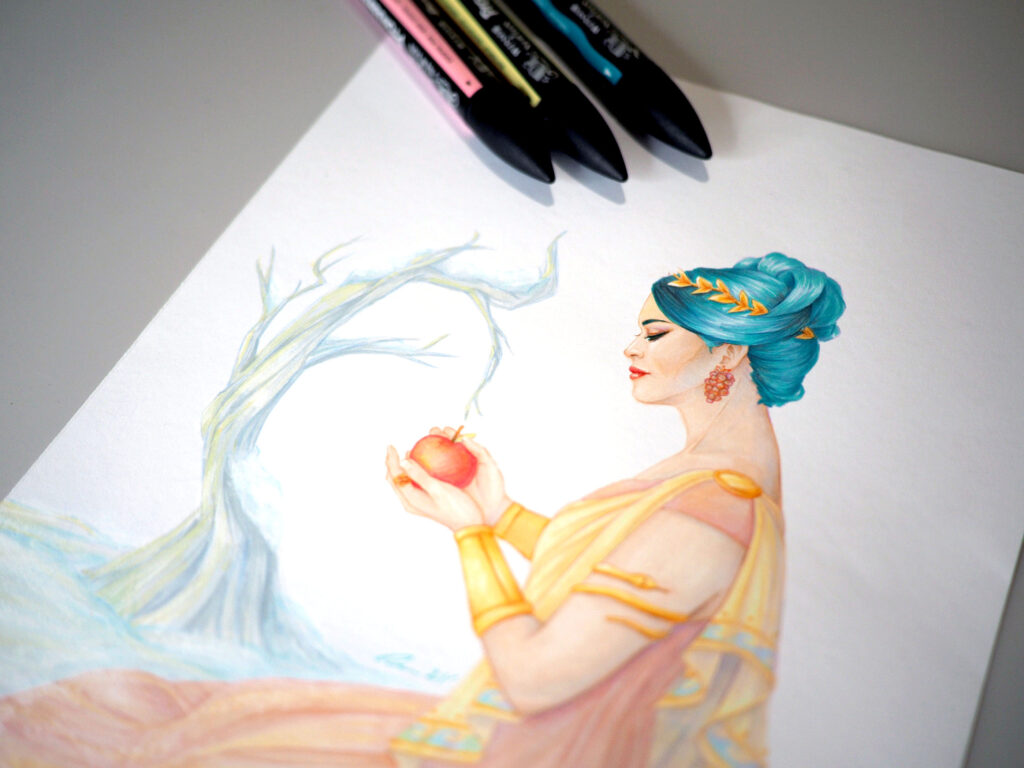
Light bounces warm AND cool tones on all objects in real life, so why only stick to one shade? Use pale blues to accentuate the shadows on the skin and the face. Likewise, use warmer colours for where the sun directly hits your subject matter. This will give your artwork a greater sense of realism as a result.
2. Test your colour palette before rendering your main artwork.
Always decide on your colour palette BEFORE rendering your main artwork. There is nothing more frustrating than using the wrong yellow hue in your work and having to start all over again after hours of rendering (trust me, I know from experience). I often photocopy my line art and experiment with different marker colours before settling on the palette I plan to use.
3. When using a new medium like markers, always work light to dark.
Start colouring your artwork with a pale hue first, before moving onto more saturated tones. This way, you can avoid the unnecessary hassle of removing a marker colour when it is too dark or saturated from your traditional artwork. Remember, you can always increase the saturation and value of your artwork later in the colouring process.